This one is a very quick correction of an error. The problem lies in trusting cursory glances stereographic projections (yes, this is the 10th time + its happened since July!). Anyway;
This is Stevens map with his caption:
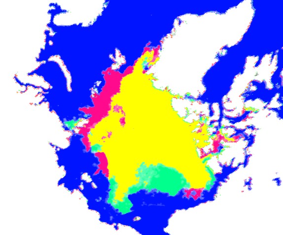
"The map below compares Sept 3, 2013 ice vs. the same date in 2009. Red shows ice present in 2009 but not present in 2013, and green shows the opposite."This is sourced from the sea ice monitor (IJIS), and they use the AMSR data. The image below is a direct copy of the 2009 vs 2013 for September 4th using their interactive viewer.
NOTE addendum: Stevens map is for the 3rd, the one below is for the 4th (see top right of image). However the maps at the bottom are all from the 3rd if you want to see my reasoning why I think my source of stevens maps is correct.

The two images are the same, the only difference being Steven has added some colour, and pasted individual layers rather than the whole thing as I have above.
Now the problem I have is this quote that follows:
"Note that there is a little more ice in 2013 than 2009"This doesn't seem to be true, at least not according to IJIS's own algorithm. See below:

(source: http://www.ijis.iarc.uaf.edu/en/home/seaice_extent_prev.htm )
The red line appears just below the orange line; this is 2010 (click to make it bigger). 2009 is the yellow line which is clearly above, not below 2009. Of course this isn't enough to say that 2013 isn't above 2009 in a general sense, but according to Stevens source this is not the case. I would ask then, what exactly is your source to make that claim?
The rest of the post is unsurprisingly about alarmists being morons or such like. I think Steven is right to say that we are better off to have ice on the beaufort side where it can mature via the beaufort gyre, rather than being washed straight down the Fram. However a single winter can only do so much, look at the ice age maps and thicknesses in my previous post. PIOMAS isn't going to jump up to the average, for example, in one year; several years are needed to buck the trend. Incidentally we are still well below the thirty year average. If 'alarmists' are going to start teeth knashing (which seems odd, as celebrating would be more likely - no one wants the ice to melt), it will be when we are getting towards 2SD above the mean rather than being on the opposite side of 'average' basically all the time.
Are the two images really the same?
My copied one, and Stevens I mean. Well, yes probably. If you need convincing here is an overlay of both images at 50% opacity.

The background map fits perfectly with a little scaling. The different projections and perspectives would make such a merge a literal nightmare if the maps were not the same (or I suppose very similar in nature). I did not need to rotate at all though, as you can see by the two boxes (inner and outer) having parallel edges.
Now light green is Stevens green hitting the white, and dark green is Stevens green hitting the purple. In the later case this is Steven showing ice in 2013, where none in 2009 when the original showed ice in 2009 and 2013. I think you may have over-egged the green area in the part north of barrow where the dark green patch is visible on the left. But it is also true that 2009 did have low concentrations of ice then, so I suppose the result is somewhat open to intepretation. Indeed all the ice in the bluish green area does have what would be considered low concentration ice by most, so stevens map could be completely right depending on his methdology.
To make it clear ill draw a table:

I cannot find any clear examples of the other colours in the table, the pale bluish colour north of Alaska is Stevens dark ocean mixing in from the map.
Since I don't want to get anything wrong. Here are the two 100% opacity images side by side. If I have made a mistake please tell me:

There is more ice in 2013 than 2009.
ReplyDeletePresently.
DeleteBut like I pointed out it depends on the measure you use. Some algorithms have 2013 marginally above 2009. But IJIS extent as referred to in the above article has 2013 below 2009 and marginally below 2010. Overall looking at all the data I would say 2013 and 2009 are not statistically significantly different. However the source from the sea ice mointer does indeed have 2013 below 2009 which is what this post was about.
Delete