This blog is mostly aimed at a source of criticism and fact checking for the blog 'real science' run by someone who goes by the name Steven Goddard. It is intended that material presented here is informative, neutral, impersonal and well sourced such that any of my claims can be checked and criticized in their own right if necessary.

Friday, 27 September 2013

Some of my conversations with Goddard.

I commented directly on his blog a few times, on some of his posts. I will present some of them here. Now, I want to make it clear I did make mistakes at times and I was not always 100% correct in my tone or my arguments but I will try and address the mistakes I made here if I can too.

The first lot came from here
http://stevengoddard.wordpress.com/2013/09/16/67-increase-in-arctic-ice-over-last-year-2/

This was a comment on using stereographic projections and pixel counting to try and estimate extent. It is something I wouldn't really try and do, because the area distortion causes pixels to have different weightings. So a lot of ice could turn out to actually be less than it looks or vice versa. Note NSDIC accounts for this in their daily extent graphs.

Steven was actually using IJIS maps to estimate ice increase. This seemed particularly odd to me as IJIS actually provide the numerical extent values for instance:( http://www.ijis.iarc.uaf.edu/en/home/seaice_extent.htm)


The commenter Chris was making a similar point to me about counting pixels. I don't know what the correction factor is, I did attempt to calculate it but am not confident enough to post anything much about it. Chris may-well be right, but I am not able to verify. However for the interested reader NSDIC provides extensive documentation on how it deals with stereographic projections: (http://nsidc.org/data/polar_stereo/ps_grids.html?file=/data/grids/ps_grid.html)

This below is the next post which I think was written in response to my comment:

https://stevengoddard.wordpress.com/2013/09/16/pixel-counting-teensy
-weensy-alarmist-brains/

My original comment was in reference to pixel counting of arctic sea ice extent maps. Steven and the NSDIC had some alleged email correspondence, and I am referring to Walt Meier here.

Steven is referring to the old 'DMI area' charts which can be seen here: (http://ocean.dmi.dk/arctic/old_icecover.uk.php). However it is noteworthy that DMI does not recommend their usage anymore due to them not taking into costal ice. Newer DMI extent maps (note now 15% cap instead of 30%) are available here:
 (http://ocean.dmi.dk/arctic/icecover.uk.php).

My point in the next post was a rather simple one. If the numeric data is avalible then why use pixel counting, a likely far cruder method than an algorithm such as IJIS.


The next comments were little more than me trying to get Steven to answer my question. I see little point in posting them, so I will just put them in text form.

Me: I take it from your non-response that you have conceded that I am right.
Steve: I take it that you don’t understand what extent and concentration mean, and are just wasting my time.
Me: Of course I know what concentration and extent are. Now answer my previous post. Stop insulting me and have the backbone to actually address my posts
Steve: I already did, but you are too dense to understand what I said.

The only vaguely useful thing here is the query about extent and concentration. I didn't know what this meant at the time. But now I presume he is talking about the difference between area and extent. The former including areas >30% concentration and the later 15%. I think later comments give a context that suggest the fact that ijis doesn't give 30% concentration figures (that I can find) is the justification.

I made a few more comments trying to get an answer, but I see little point in posting them as I got no response you can view them on his blog if you like.


My first comment was about a previous post Steven had made similar to the first link. I mention here the fact that some low concentration ice in 2009 had been apparently ignored in the Laptev area. This again is evidence for wanting a 30%< number. The comment about DMI is irrelevant to the criticism at hand which is why I made the 2nd comment below. 


Another conversation I had with steven is on this post:
http://stevengoddard.wordpress.com/2013/09/10/arctic-ice-experts-say-the-arctic-is-past-the-point-of-no-return/

I have commented on using these national geographic maps before. This was me directly addressing Steven about them.

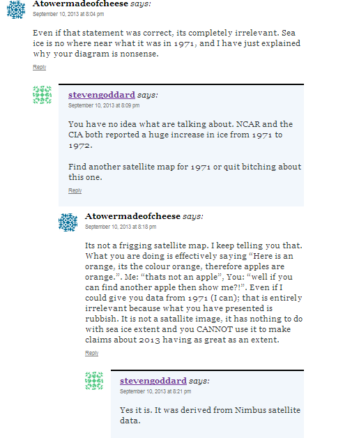
My first comment was about using a national geographic map from 1971 to make claims about sea ice extent. As I have mentioned previously the national geographic map in question only mentioned 'multiyear ice limit'. I assumed here it meant maximum (though I turned out to probably be wrong about this as ill explain soon). Steven had used this map to make an overlay with one from 2013. I don't know what this actually was specifically, he didn't say. I suspect it was the daily arctic sea ice image from NSDIC September 9th. Because the green area in his image looks alot like September 9th sea ice extent, and the funny colored line would be from the NSDIC 1981-2000 average line. Also there are bits of false ice in all the places that the NSDIC daily maps would have. Of course, I cannot prove this. But the jist of this was, apples are being compared against oranges. The extent is not the same as 'multiyear ice limit' so any comparison is useless.


Anyway the commenting continues:


My first comment is a reference to steven last comment in the above paragraph. Steven then writes about ice increasing from '71 to '72. And actually this does seem to be true. Of course it is still not relevant to my point.

The claim that the national geographic map was derived from satellite data may well be true, but then again it might not. A citation was not provided in any case, and this doesn't change the fact we are still talking about MYI.


Cont.


My comment here was refering directly to the national geographic map 'mutliyear ice limit' label. You can see a zoomed in image of this on an earlier one of my blogposts. Incidentally the 1971 national geographic map can be seen in full here: (http://www.maps.com/map.aspx?pid=15903)

 It turned out we were both wrong (probably) on our interpretations. Although mine was plausible to begin with (i.e consistant with the map label). I think now that the label is actually referring to the minimun multiyear ice limit . The reason I think this is from looking at a similar map from 1983, which had a label to this effect:(http://www.maps.com/map.aspx?cid=92&pid=15610)

Even now the interpretation is still a little ambiguous. For instance does multiyear ice mean 2+ year old ice  or 3+ year old ice. The former is often called 'second year ice' and 3+ year old ice is called simply 'old ice' a term which is used exchangably with 'multi year ice'. In this context I am still not sure. Secondly does 'minimum' refer to the time when there is least MYI that has an age of precisely 2 years or 3 years (or even 1 year) depending on the definition, or is it like the NSDIC method where ice is aged by 1 year every September - in which case are we looking at the MYI before the aging or after?  These questions all have to be answered before such a comparison is justified.


This is more of the same. The link I provided was just the zoomed in label from before.

Steven is wrong here, the burden of proof is on the person that made the claim. I did not claim that 1971 was not of a lesser extent than 2013. I simply demanded evidence to show that it was, and I would not consider the image Steven provided as evidence; fairly reasonable given a few of the problems I have listed.


There were a few more posts then that I made about how the overlays were made and photoshopping. Which I don't think are interesting enough to post. Steven then asks me again to provide evidence that his claim is false. Again, I don't have to do this. One doesn't have to provide evidence that a claim made isn't true in order to ask that reasonable evidence is given in support of said claim. In reality, there is evidence that the sea ice extent in 1971 is much greater than 2013, but this isn't really the point.

Next:


This is me trying to get to grips with the interpretation of the label. As you might notice it isn't as lucid as it is here. Steven is actually right that the NSDIC ages sea ice every year. But it still isn't clear that say 1 month ice in October counts as first year ice like the NSDIC definition. I would guess it does, and my comment here probably isn't helpful but, again, this is still a question that needs to be resolved.

So instead I offer NSDICs interpretation of sea ice extent in '71; something I shouldn't really have to do to refute an inappropriate comparison (even if '71 had the same extent as 2013 it wouldn't necessarily make what Steven is doing valid).


So my comments continue in direct response to what Steven says:

The 1990 IPCC report can incidently be found here: (www.ipcc.ch/ipccreports/far/wg_I/ipcc_far_wg_I_full_report.pdf‎)

The paper I linked in, was referenced in the 1990 IPCC report and is relevant here.

The irony is, Steven is right in his last comment. This diversion is interesting but pointless. I don't have to show that '71 had a greater extent than '13 because Steven still hasn't justified the use of the national geographic map to make that claim in the first place.


It turns out it probably did mean minimum after all!


There are more comments of mine on realscience, but this is a fairly decent sample anyway. Now I think it would be quite interesting to compare the 1983 national geographic map with the sea ice minimum in 1983; since both are easily available (the advantages over the 1971 map are that the satellite data was more 'complete' after '79 and the national geographic map label was less ambiguous).

1983 Arctic Ocean Map
(source: http://shop.nationalgeographic.com/ngs/product/maps/wall-maps/classic-maps/1983-arctic-ocean-map)

Note: of course I am assuming the white area represents the same in this map as in the '71 map. I cannot prove this, although it seems to be a fairly safe assumption. The point is that the fact checking of these labels is the responsibility of the claimant, not me. Incidentally the white area is pretty difficult to see in the Siberian section as it is on the very pale blue of the shallow sea. I recommend zooming into the map. To help, I will say that the most southern extent of the white area (in the siberian part) is about the same as severnya zemyla which is the north island towards the top of the map.

Now compare to the minimun extent of 1983. I am assuming this is roughly september 4th, which is the day where the CT sea ice area was at its lowest. Ill include two images of september 4th and september 12th anyway from 1983.
 
(source: http://igloo.atmos.uiuc.edu/cgi-bin/test/print.sh?fm=09&fd=04&fy=1983&sm=09&sd=11&sy=1983)

As expected they are similar. In either case they show significantly different distributions to the white area in the national geographic map. There is sea ice in the Laptev, and southern Siberian seas that completely closes of the N route (if we were to take the national geographic map to mean sea ice minimum then this is contradictory). The Beaufort too is a good place to look, the ice comes right to the coast in the CT maps.


Anyway I think this is at least enough to show that Stevens use of the maps is not enough to show that 2013 had a higher sea ice extent than 1971. A further issue, that I don't think I mentioned in the comments is that the 2013 sea ice extent was not used during its actual minimum.


Tuesday, 10 September 2013

You misunderstood the animation Steven.

http://stevengoddard.wordpress.com/2013/09/10/john-cook-truncates-both-ends-of-the-sea-ice-data-in-pursuit-of-keeping-his-followers-misinformed/

Firstly sea ice is no where near 1971 levels; I covered that here: (http://realrealscience.blogspot.co.uk/2013/09/you-didnt-read-your-own-sources-steven.html)

And the whole point of this GIF animation:

(source: skepticalscience.com)

Is to illustrate the differences between trends and natural variability. Also considering this animation was made last year and the minimum of 2013 hasn't even occurred yet (let alone the whole of september) it should be of no surprise to anyone that the 2013 point is absent. As for the 1979 point being truncated? I don't know, but if this is your case against the point of this graphic; it is a pretty weak one. Add 1979 to this graph if you like, NSDIC has it slightly above 1980, it really is going to make very little difference to the animation, and it makes no difference at all to the point. A point which you keep missing, attested by the continued fixation of 2013 being above 2012 i.e regression to the mean.

Monday, 9 September 2013

Sea ice in 1923

Note that Gavin seems to be doing a pretty good job of defending himself: https://twitter.com/ClimateOfGavin/status/377132026932895745

http://stevengoddard.wordpress.com/2013/09/09/is-gavin-setting-himself-up/

Gavin asked whether he thought there was less ice in 1923 or today? Steven replied with a historical weather review article from November the previous year. The article was very interesting and talked mostly about how the sea ice had receded significantly compared to previous years, and of a warming. Observations such as open water to the 81st parallel were made. The problem here is; steven is not answering Gavins question. A sea ice recession in the twenties does in no way prevent sea ice extent from being less now than it was then, and detail from the actual newspaper doesn't help so much either (for example there is open water to the 81st parallel now on the Atlantic side). A direct comparision is needed, and this is difficult, as there is a reliance on first hand observations such as shipping data; unlike the satellite record now the conditions in the arctic are much less well known. However I give two sources that we may at least get an indication of the differences; the first is from the danish meteorological institute (DMI)

(source: sidads.colorado.edu)
The white area is the presumed arctic sea ice extent in August 1923. It is significantly greater extent-wise than 2013 when taken on value. However the red areas are the most important, as they were direct observations taken during that year, so we can be confident they are reasonably accurate. We see a few interesting features like ice in the kara sea north of novaya zeymla and in the chuckini sea that definitely was not present this August. On this evidence alone we might conclude that 2013 does have less ice (in August at least). The longer term time series (some of which I posted in the previous post back this up). Notice that open water is present to 80N, and probably 81N (you can see the boundary clearly north of Svalbard). These days having open water north of 80 degrees is not that much of an achivement.

The other map is from the J walsh monthly series


(source: http://www.aari.nw.ru/gdsidb/gdsidb_2.html)

More information about the J walsh series may be found here:
https://climatedataguide.ucar.edu/climate-data/walsh-and-chapman-northern-hemisphere-sea-ice

I think when you look at publications based on long term sea ice history (some have been given in the previous post) I think it is very reasonable to conclude the sea ice extent in 2013 is less than it was in 1923. Not that I think that the contents of this blog post would be enough to meet the standards of evidence, but I think time series constructed in journal articles are pretty rigorous and convincing (e.g m Kinnard et al., 2008).

Steven vs Trends

(quotes will be in italic font type)

http://stevengoddard.wordpress.com/2013/09/09/the-long-term-trend-towards-scientific-stupidity/

A day or so after I published my take on the daily mails very flawed (and that is being generous) article, the guardian did an even better job and can be viewed here:

http://www.theguardian.com/environment/climate-consensus-97-per-cent/2013/sep/09/climate-change-arctic-sea-ice-delusions

Steven has attempted to post his own rebuttal to this article. In fact very little of the entire thing was brought up, S only chose to 'debunk' a few points.

Alarmists like Nuttercelli are hiding behind what they call “the long term trend” in Arctic ice, as a way to avoid a serious discussion about the 60% increase in ice this year.
 Actually the article did acknowledge the truth of the 60% increase as can be seen in the following quotation:
While this factoid is technically true, it's also largely irrelevant.
The article makes a point of backing up this claim of irrelevance and that is the whole point of the article. I am not however above the very basic technical fact checking. What is your source of the 60% increase steven? Different algorithms spit out different figures, if you provide no source then it makes it all the more difficult to verify. I gave the daily mail the benefit of the doubt and used the NSDIC August figure, but I am getting tired of having to do this.

 The first thing to note is that NSIDC starts their graph at the century maximum in 1979. In the early 1970s, sea ice was much less extensive than later in the decade. If NSIDC included the entire satellite record in their graph, it would look like a sine wave, not a straight line.

The claim that 1979 is the centuary maximun is extremely dubious. I cannot find a reliable source that can confirm this claim. Steven links back to an early IPCC report, and a sea ice NH extent diagram that only goes back to circa 1972. Indeed 1979 does seem to be at a maximun, although a close inspection shows that this is only true for the winter period, and indeed subsequent years have probably higher maxima in August according to the diagram. The NSDIC also produced a long term chart which I have copied in below (hopefully this should address Stevens final sentence).


(source: http://nsidc.org/icelights/2011/01/31/arctic-sea-ice-before-satellites/)

appearing to also contradict the claim that 1979 was a century maximum (if this is still not enough here is a further source that appears to disagree with stevens claim: http://onlinelibrary.wiley.com/doi/10.1029/2007GL032507/)  Even if it was a century maximun (citation still needed), there is a legitimate reason for it being the first point on the graph; that is when the reliable satellite record began so is certainly not arbitrary in stark contrast to taking 1998 as a start year in the global temperature record, a very strong  el nino year.
Another important issue is that plotting linear trends on short sections of a cyclical function – is junk science and mathematics. Even if August ice was at an all-time record high, the post-1979 linear trend would still be down, as shown in the demonstration purposes only graph below.
I think you might have misunderstood Anthony Watt here Steven. I don't mean to be insulting for no reason but you are confusing your mistake here:

http://wattsupwiththat.com/2010/07/02/arctic-ice-increasing-by-50000-km2-per-year/


with an appropriate place to take a linear trend line. Firstly August monthly sea ice extent averages plotted yearly are not cyclical in the same way that plotting daily sea ice extent are. In the later case there is a well defined period (a year), and amplitude (although it may vary) can quite easily be defined also. Now compare to the graph from the nsdic you are trying to debunk:

ScreenHunter_404 Sep. 09 09.36
No easily defined period, or amplitude. And it certainty does not look like a sine wave. There may be natural 'cycles' hidden in there to some degree, but that is certainly a conclusion that cannot come from looking at this graph alone, and if it is being used as a premise then, again, it should be sourced appropriately.

This quote from Anthony watts (on your article) seems strangely appropriate:
This is always a problem with graphing any cyclical trend, but the short length of the record (8 years) makes it more problematic than what would be seen in a 30 year record.
But whatever way you look at it Steven, the summer sea ice NH trend is still down (as it is incidentally in other months too). You are actually correct that introducing an anachronistic 2013 point above 1979 would not change the overall trend, if this had happened it would be an anomaly and it certainly would raise a few eyebrows. However the only way the long term trend is going to stop pointing down, is several years that continuously make it above the current trend. Otherwise such an anomaly is as meaningless as 2013 being above 2012 as the guardian article pointed out.

Sunday, 8 September 2013

Ice growth and warming are not mutually exclusive.

"There has been no warming in Antarctica for 30 years, and sea ice is at record highs."

http://stevengoddard.wordpress.com/2013/09/08/crack-scientists-say-that-melting-antarctic-ice-threatens-penguins/

Antarctic Warming Trends

Color bar for Antarctic Warming Trends

(source: http://earthobservatory.nasa.gov/IOTD/view.php?id=36736 )

Daily mail: "Record return of Arctic ice cap as it grows by 60% in a year with top scientists warning of global COOLING"


 This was recently posted on stevens blog, and its in the mainstream media; so its perhaps worth a look.

"A chilly Arctic summer has left nearly a million more square miles of ocean covered with ice than at the same time last year – an increase of 60 per cent."
This is a little ambiguous, are we talking about a daily figure, or perhaps the entire month of August? Either could be a reasonable interpretation. In the later case the nsdic does indeed have 2013 at "919 000 square miles" above 2012. So this seems all very reasonable so far. As for 'chilly summer', again this is open to interpretation too, but when talking about the northern most arctic region it is certainly true that it has been colder than average for most of the summer.

"The rebound from 2012’s record low comes six years after the BBC reported that global warming would leave the Arctic ice-free in summer by 2013."

Yes the BBC did release a news article in 2007 where a reseacher,  Prof. Wieslaw Maslowski commented on the model projections as 2013 to be ice free. It is worth noting that the BBC offered alternative estimates for an ice free arctic including predictions of 2030 or "earlier than 2040". What I would like to do, is find an actual paper from circa 2007 and have a look at the abstract at least, it would be a fairly interesting exercise to see exactly what went into that prediction. Unfortunately, as is too often the case I have not been able to find what I wanted. However Maslowski has a lot of very interesting papers about the arctic vieweable on scholar. But to be clear, this was one view in the scientific community, based on a model prediction. To highlight this with any implication that the arctic is recovering or such like is somewhat inappropriate.

"Instead, days before the annual autumn re-freeze is due to begin, an unbroken ice sheet more than half the size of Europe already stretches from the Canadian islands to Russia’s northern shores."
The area of Europe is actually surprisingly difficult to get a reliable figure for. Wikipedia does have a figure (about 10 million square kms) but it appears to be unsourced. Although half of this at 5 million square kms is a bit less than NSDICs figure of ~6 million square kms. And also, does 'ice sheet' include the land ice of greenland? I think ill just leave this one alone, the area of Europe in itself is could cause arguments related to the boundry between it and Asia.

"The Northwest Passage from the Atlantic to the Pacific has remained blocked by pack-ice all year. More than 20 yachts that had planned to sail it have been left ice-bound and a cruise ship attempting the route was forced to turn back."

Well, I am still not certain if the southern part has been blocked. There have been reports that there is considerably more ice than in recent years see mainstreamlastfirst.com for example.  And the main, northern part of the NW passage has certainty remained closed. But yes, I think this is true from what I gather.

"Some eminent scientists now believe the world is heading for a period of cooling that will not end until the middle of this century – a process that would expose computer forecasts of imminent catastrophic warming as dangerously misleading."
Claims like this must  be sourced. If no citation is provided then it is impossible to check such claims, or whether said scientists even exist.  No name was provided, no paper, no journal, no credentials.

"The disclosure comes 11 months after The Mail on Sunday triggered intense political and scientific debate by revealing that global warming has ‘paused’ since the beginning of 1997 – an event that the computer models used by climate experts failed to predict."
"The pause – which has now been accepted as real by every major climate research centre – is important, because the models’ predictions of ever-increasing global temperatures have made many of the world’s economies divert billions of pounds into ‘green’ measures to counter  climate change."
"The continuing furore caused by The Mail on Sunday’s revelations – which will now be amplified by the return of the Arctic ice sheet – has forced the UN’s climate change body to hold a crisis meeting."
It is ridiculously arrogant for the daily mail (or any newspaper for that matter) to claim credit for something like this. Even most of the blogs have been talking about the 'pause' for longer than the last 11 months, indeed even Steven would be in a better position to take credit. In any case here is a journal article from science in 2009 http://www.sciencemag.org/content/326/5949/28.1.short 
The idea that the daily mail has forced the IPCC to hold a 'crisis meeting' is almost laughable. Still, its a case of guilty until proven innocent. The buden of proof is on the daily mail to show that they are the distal cause behind any delay.

There is also talk, of leaked IPCC files. Personally it makes more sense to wait and actually see what the fifth assessment report says. The remainder of the article does contain opinions of atmospheric scientists: proffesor Judith currey, proffesor Anastasios A Tsonis, and Dr Ed hawkings. It should be noted that none of them mention this so called global cooling. In the case of Prof A Tsonis I would strongly urge the Daily Mail to read his own paper in full:

"Has the climate recently shifted?

Kyle L. Swanson, Anastasios A. Tsonis"

I particularly suggest that the conclusion of the paper is read; it does not seem to completey support what the Daily mail is saying. The DOI is here: 10.1029/2008GL037022.

 "Finally, it is vital to note that there is no comfort to be gained by having a climate with a significant degree of internal variability, even if it results in a near-term cessation of global warming."

An example of a quote taken from the papers conclusion. The full paper may be read at:
GEOPHYSICAL RESEARCH LETTERS, VOL. 36, L06711, doi:10.1029/2008GL037022, 2009

Friday, 6 September 2013

ibtimes news article: 'Arctic Ocean Losing Sea Ice At An Alarming Rate'

I am often very wary when reading mainstream media articles about sea ice. Not withstanding any 'human global warming' opinions they are prone to over exaggeration of the source material and can come to conclusions that are not even supported by the source (which sometimes aren't even directly given).  Steven is criticising this article:

http://www.ibtimes.com/arctic-ocean-losing-sea-ice-alarming-rate-nasa-1398031

in this blog post:

http://stevengoddard.wordpress.com/2013/09/06/nasa-losing-credibility-at-an-alarming-rate/

Actually the criticism is more directly aimed at NASA, but since we are linked to this article I will have a quick look at whether anything is indeed 'alarmist'.

Now given that the only things given in the blog post are two images, one of simply the title of the ibtimes article: 'Arctic Ocean Losing Sea Ice At An Alarming Rate', one of the (now considered obsolete by a newer graph) dmi graphs showing sea ice at its highest since 2006.

The actual times article can be summarized in the following points:
  • This year was not a record melt year, but the trend is still very much downwards
  • Meteorology has influenced this years higher sea ice levels
  • Antarctic sea ice continues to grow with an upward trend
All of these points are demonstrably correct (although the 2nd requires more work than the other two which are little more than direct observations) , for example this is the August trend in sea ice extent courtesy of the nsdic. Note that although summer sea ice is decreasing faster than winter sea ice the long term trend in both cases is down. 

Now what Steven is effectively doing is concentrating on the last 5 or so points on the graph, and making the observation that 2013 is significantly above 2012. This is also demonstrably true, but to imply any great significance to this such as NASA being incorrect about long term trends is not appropriate. No matter how low the sea ice gets we are still likely to see years that improve on the previous, but unless this becomes consistent it cannot be considered important for long term predictions.