The first lot came from here
http://stevengoddard.wordpress.com/2013/09/16/67-increase-in-arctic-ice-over-last-year-2/

Steven was actually using IJIS maps to estimate ice increase. This seemed particularly odd to me as IJIS actually provide the numerical extent values for instance:( http://www.ijis.iarc.uaf.edu/en/home/seaice_extent.htm)

This below is the next post which I think was written in response to my comment:
https://stevengoddard.wordpress.com/2013/09/16/pixel-counting-teensy
-weensy-alarmist-brains/

Steven is referring to the old 'DMI area' charts which can be seen here: (http://ocean.dmi.dk/arctic/old_icecover.uk.php). However it is noteworthy that DMI does not recommend their usage anymore due to them not taking into costal ice. Newer DMI extent maps (note now 15% cap instead of 30%) are available here:
(http://ocean.dmi.dk/arctic/icecover.uk.php).
My point in the next post was a rather simple one. If the numeric data is avalible then why use pixel counting, a likely far cruder method than an algorithm such as IJIS.
The next comments were little more than me trying to get Steven to answer my question. I see little point in posting them, so I will just put them in text form.
Me: I take it from your non-response that you have conceded that I am right.
Steve: I take it that you don’t understand what extent and concentration mean, and are just wasting my time.
Me: Of course I know what concentration and extent are. Now answer my previous post. Stop insulting me and have the backbone to actually address my posts
Steve: I already did, but you are too dense to understand what I said.
The only vaguely useful thing here is the query about extent and concentration. I didn't know what this meant at the time. But now I presume he is talking about the difference between area and extent. The former including areas >30% concentration and the later 15%. I think later comments give a context that suggest the fact that ijis doesn't give 30% concentration figures (that I can find) is the justification.
I made a few more comments trying to get an answer, but I see little point in posting them as I got no response you can view them on his blog if you like.

Another conversation I had with steven is on this post:
http://stevengoddard.wordpress.com/2013/09/10/arctic-ice-experts-say-the-arctic-is-past-the-point-of-no-return/
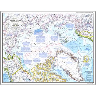
I have commented on using these national geographic maps before. This was me directly addressing Steven about them.

Anyway the commenting continues:
My first comment is a reference to steven last comment in the above paragraph. Steven then writes about ice increasing from '71 to '72. And actually this does seem to be true. Of course it is still not relevant to my point.
The claim that the national geographic map was derived from satellite data may well be true, but then again it might not. A citation was not provided in any case, and this doesn't change the fact we are still talking about MYI.
Cont.

My comment here was refering directly to the national geographic map 'mutliyear ice limit' label. You can see a zoomed in image of this on an earlier one of my blogposts. Incidentally the 1971 national geographic map can be seen in full here: (http://www.maps.com/map.aspx?pid=15903)
It turned out we were both wrong (probably) on our interpretations. Although mine was plausible to begin with (i.e consistant with the map label). I think now that the label is actually referring to the minimun multiyear ice limit . The reason I think this is from looking at a similar map from 1983, which had a label to this effect:(http://www.maps.com/map.aspx?cid=92&pid=15610)
Even now the interpretation is still a little ambiguous. For instance does multiyear ice mean 2+ year old ice or 3+ year old ice. The former is often called 'second year ice' and 3+ year old ice is called simply 'old ice' a term which is used exchangably with 'multi year ice'. In this context I am still not sure. Secondly does 'minimum' refer to the time when there is least MYI that has an age of precisely 2 years or 3 years (or even 1 year) depending on the definition, or is it like the NSDIC method where ice is aged by 1 year every September - in which case are we looking at the MYI before the aging or after? These questions all have to be answered before such a comparison is justified.

This is more of the same. The link I provided was just the zoomed in label from before.
Steven is wrong here, the burden of proof is on the person that made the claim. I did not claim that 1971 was not of a lesser extent than 2013. I simply demanded evidence to show that it was, and I would not consider the image Steven provided as evidence; fairly reasonable given a few of the problems I have listed.
There were a few more posts then that I made about how the overlays were made and photoshopping. Which I don't think are interesting enough to post. Steven then asks me again to provide evidence that his claim is false. Again, I don't have to do this. One doesn't have to provide evidence that a claim made isn't true in order to ask that reasonable evidence is given in support of said claim. In reality, there is evidence that the sea ice extent in 1971 is much greater than 2013, but this isn't really the point.
Next:

This is me trying to get to grips with the interpretation of the label. As you might notice it isn't as lucid as it is here. Steven is actually right that the NSDIC ages sea ice every year. But it still isn't clear that say 1 month ice in October counts as first year ice like the NSDIC definition. I would guess it does, and my comment here probably isn't helpful but, again, this is still a question that needs to be resolved.
So instead I offer NSDICs interpretation of sea ice extent in '71; something I shouldn't really have to do to refute an inappropriate comparison (even if '71 had the same extent as 2013 it wouldn't necessarily make what Steven is doing valid).
So my comments continue in direct response to what Steven says:

The paper I linked in, was referenced in the 1990 IPCC report and is relevant here.
The irony is, Steven is right in his last comment. This diversion is interesting but pointless. I don't have to show that '71 had a greater extent than '13 because Steven still hasn't justified the use of the national geographic map to make that claim in the first place.

It turns out it probably did mean minimum after all!

There are more comments of mine on realscience, but this is a fairly decent sample anyway. Now I think it would be quite interesting to compare the 1983 national geographic map with the sea ice minimum in 1983; since both are easily available (the advantages over the 1971 map are that the satellite data was more 'complete' after '79 and the national geographic map label was less ambiguous).
(source: http://shop.nationalgeographic.com/ngs/product/maps/wall-maps/classic-maps/1983-arctic-ocean-map)
Note: of course I am assuming the white area represents the same in this map as in the '71 map. I cannot prove this, although it seems to be a fairly safe assumption. The point is that the fact checking of these labels is the responsibility of the claimant, not me. Incidentally the white area is pretty difficult to see in the Siberian section as it is on the very pale blue of the shallow sea. I recommend zooming into the map. To help, I will say that the most southern extent of the white area (in the siberian part) is about the same as severnya zemyla which is the north island towards the top of the map.
Now compare to the minimun extent of 1983. I am assuming this is roughly september 4th, which is the day where the CT sea ice area was at its lowest. Ill include two images of september 4th and september 12th anyway from 1983.

(source: http://igloo.atmos.uiuc.edu/cgi-bin/test/print.sh?fm=09&fd=04&fy=1983&sm=09&sd=11&sy=1983)
As expected they are similar. In either case they show significantly different distributions to the white area in the national geographic map. There is sea ice in the Laptev, and southern Siberian seas that completely closes of the N route (if we were to take the national geographic map to mean sea ice minimum then this is contradictory). The Beaufort too is a good place to look, the ice comes right to the coast in the CT maps.
Anyway I think this is at least enough to show that Stevens use of the maps is not enough to show that 2013 had a higher sea ice extent than 1971. A further issue, that I don't think I mentioned in the comments is that the 2013 sea ice extent was not used during its actual minimum.
No comments:
Post a Comment
Note: only a member of this blog may post a comment.